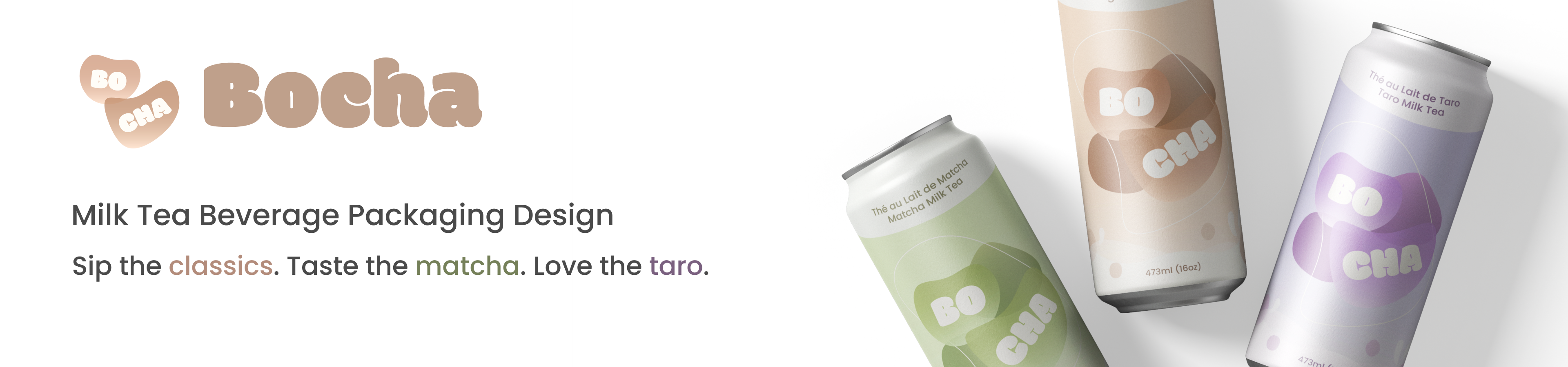
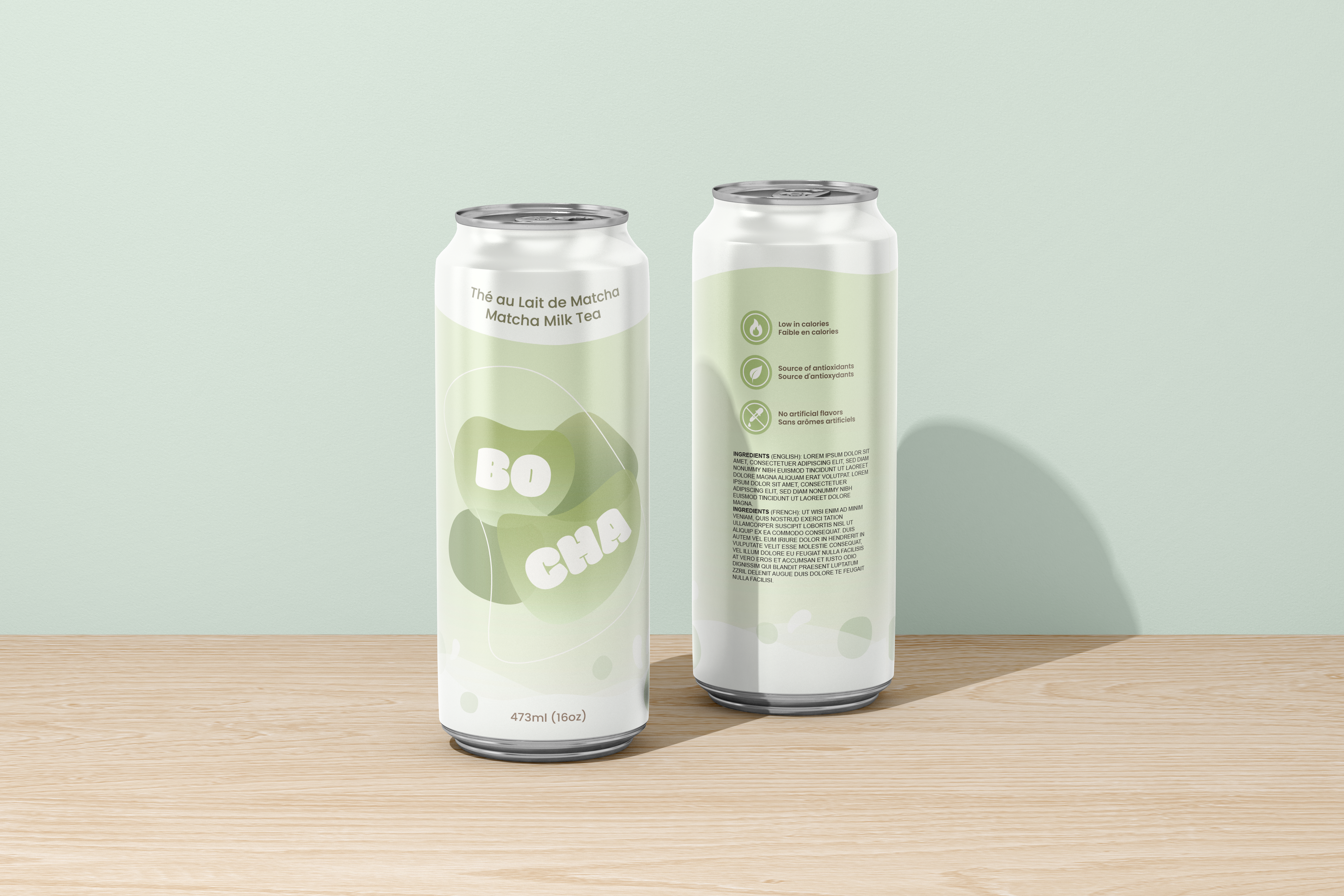
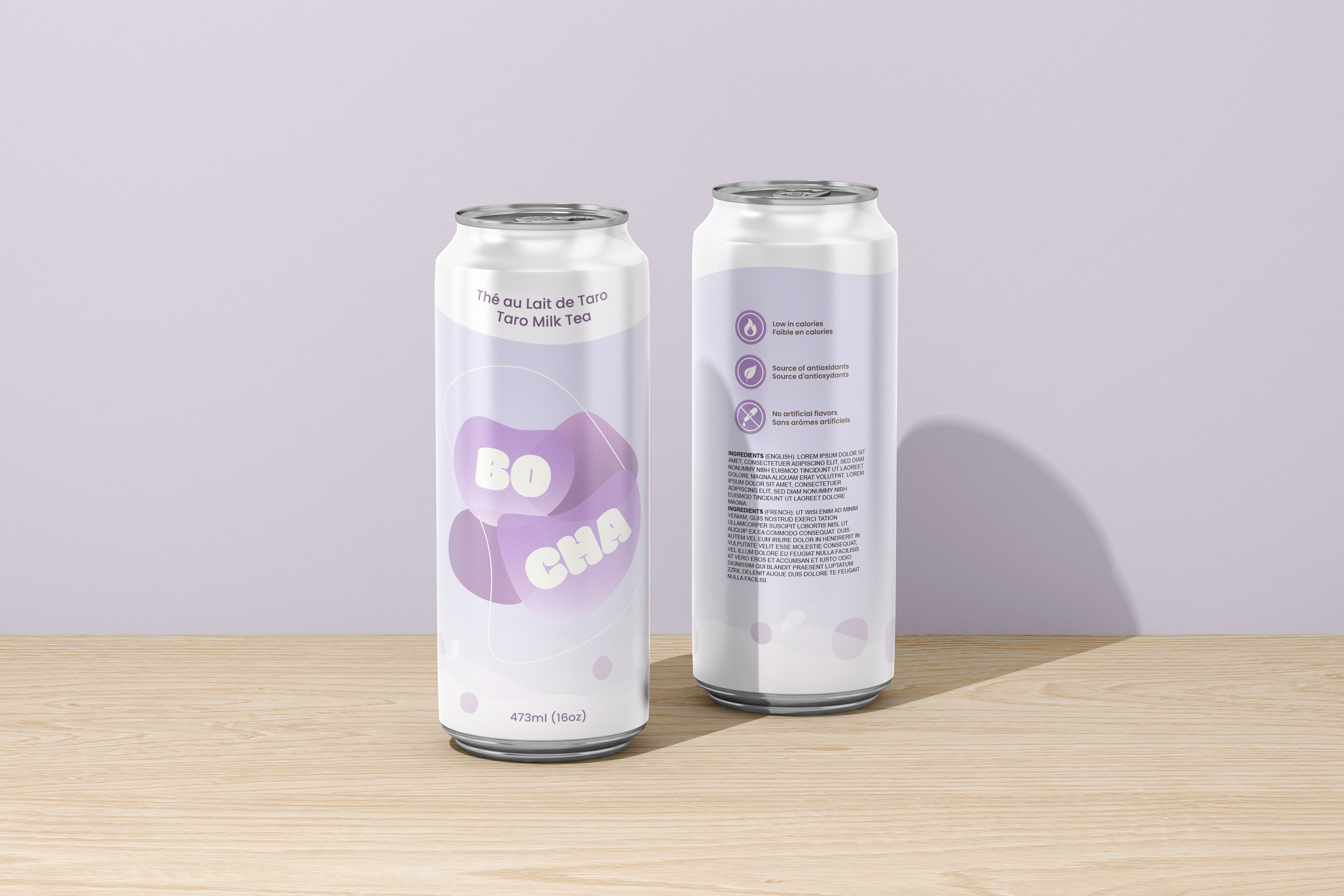
Bocha
This project was a packaging design for Bocha, a conceptual bubble tea beverage brand. The objective was to create a series of cohesive can designs that distinguish each flavour while maintaining a unified brand identity. The visual direction emphasizes a fun, approachable, and modern aesthetic to appeal to a broad audience of milk tea lovers.
Role
Graphic Design
Tools
Adobe Illustrator
Duration
Oct 2024 - Nov 2024 (1 month)
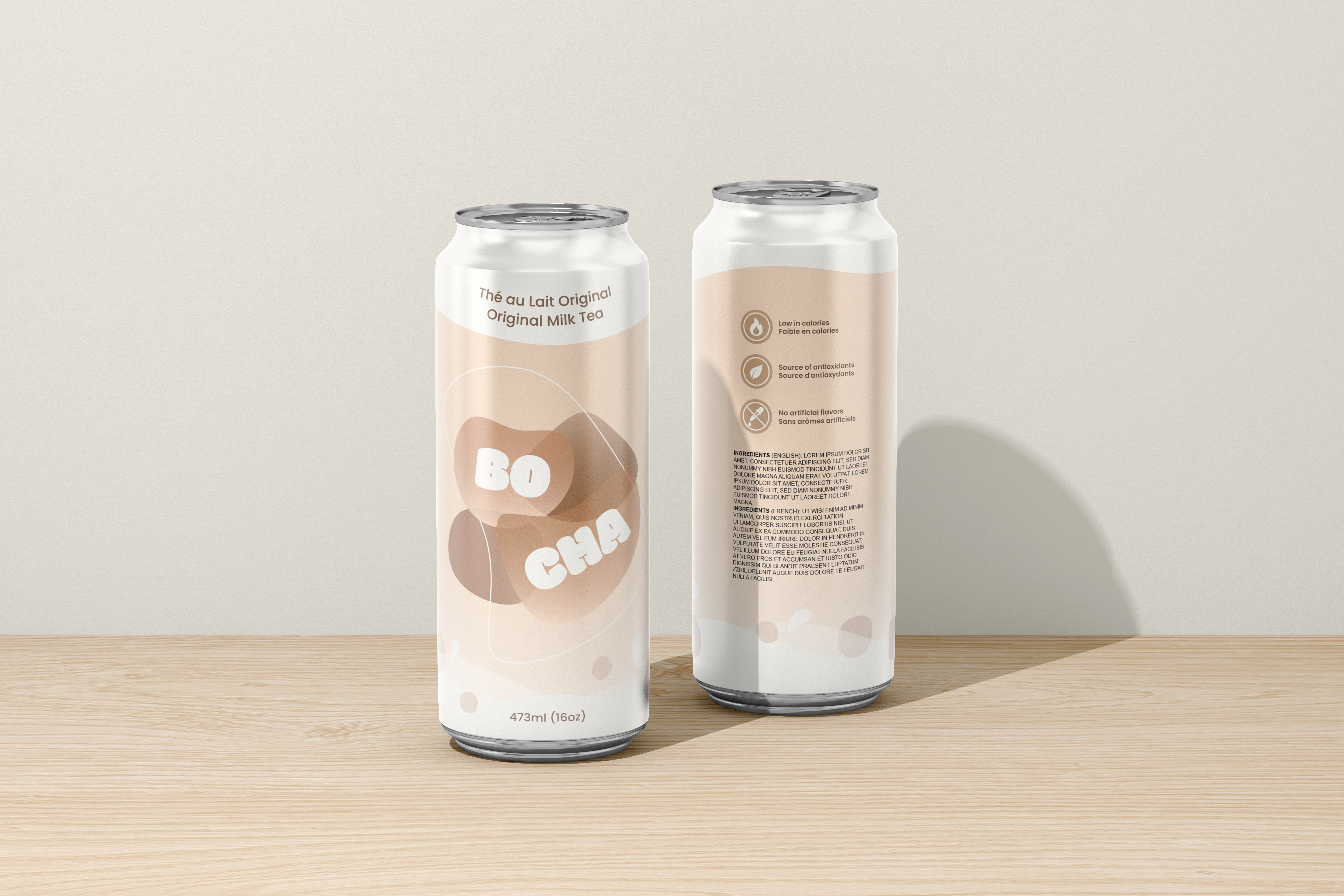
Mock-up
Creative Process
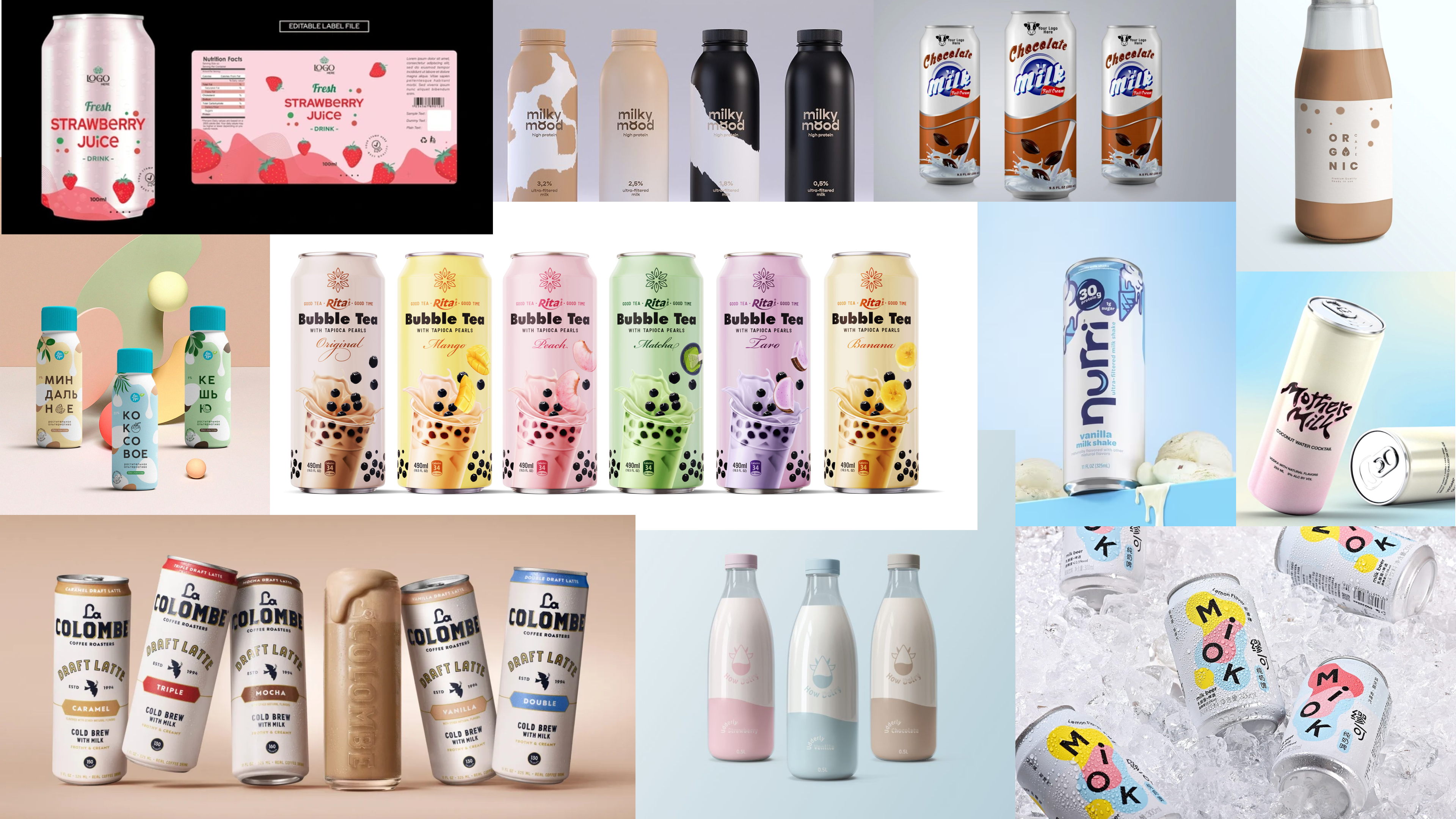
- Research and Inspiration:
- To establish a distinctive brand identity, I studied existing beverage packaging trends, with a focus on bubble tea and flavored drinks. I analyzed how brands differentiate flavours while preserving visual unity across product lines.
Proof Design
Production-ready dielines were created for each can. This stage focused on technical precision, ensuring proper bleed, safe zones, alignment, and bilingual labels, providing a clear guide for print proofing and manufacturer handoff.
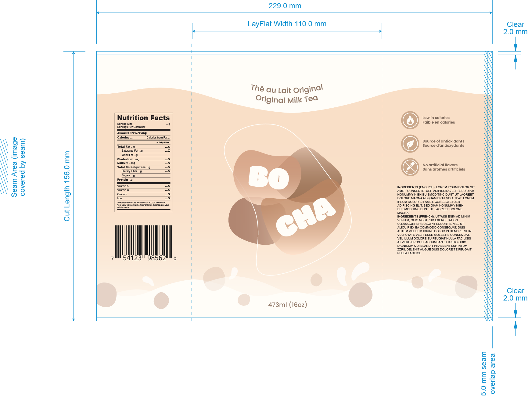
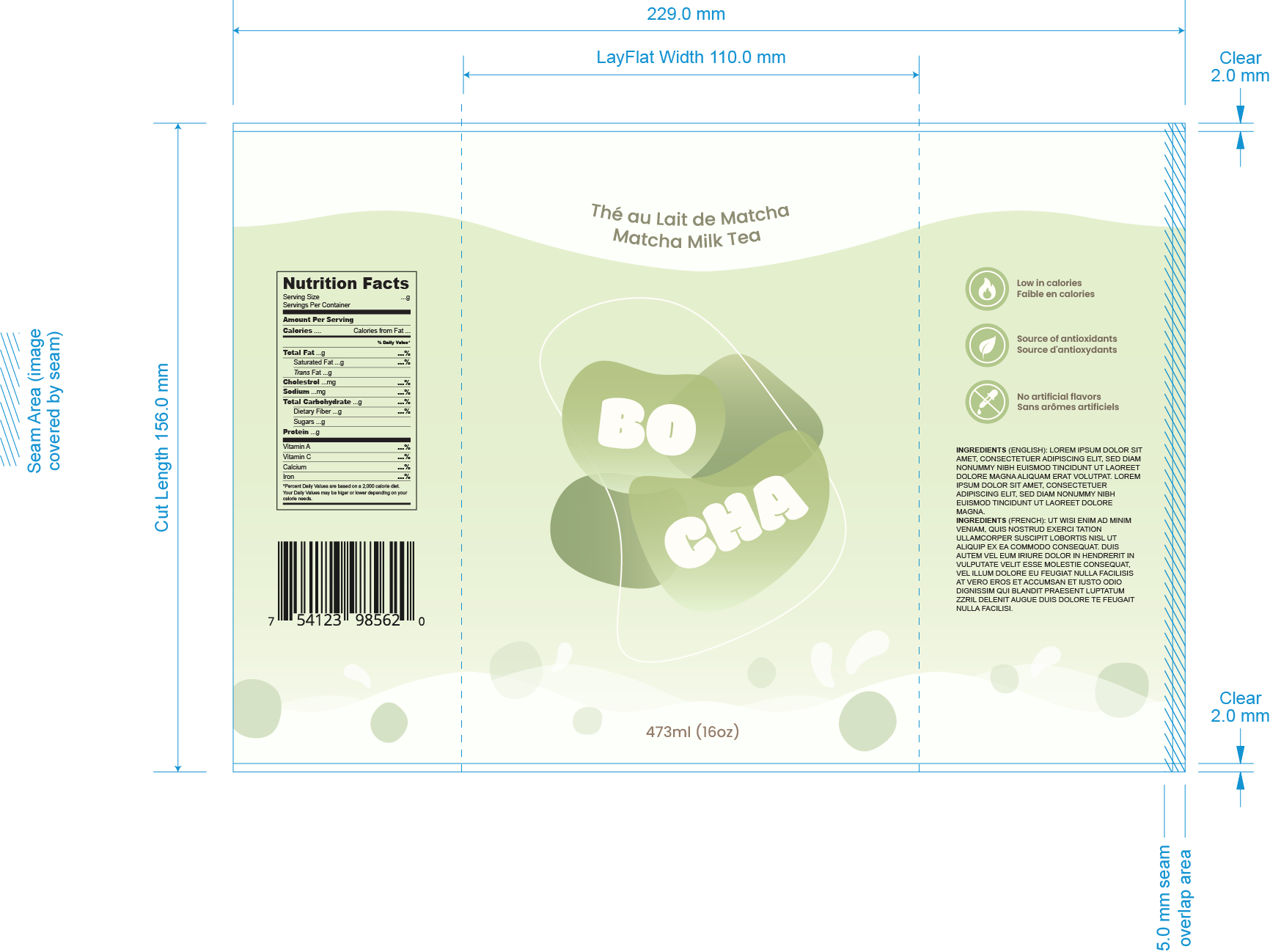
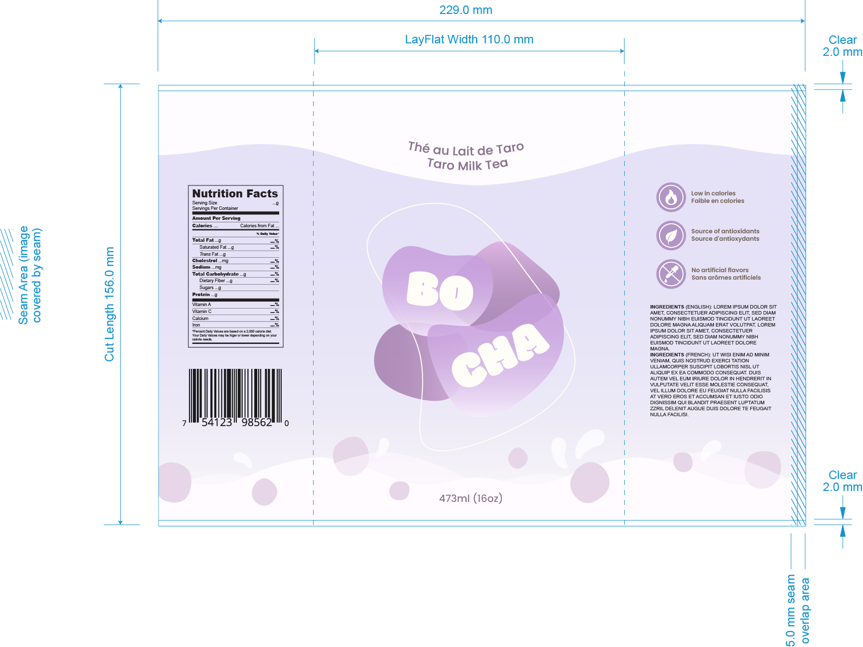
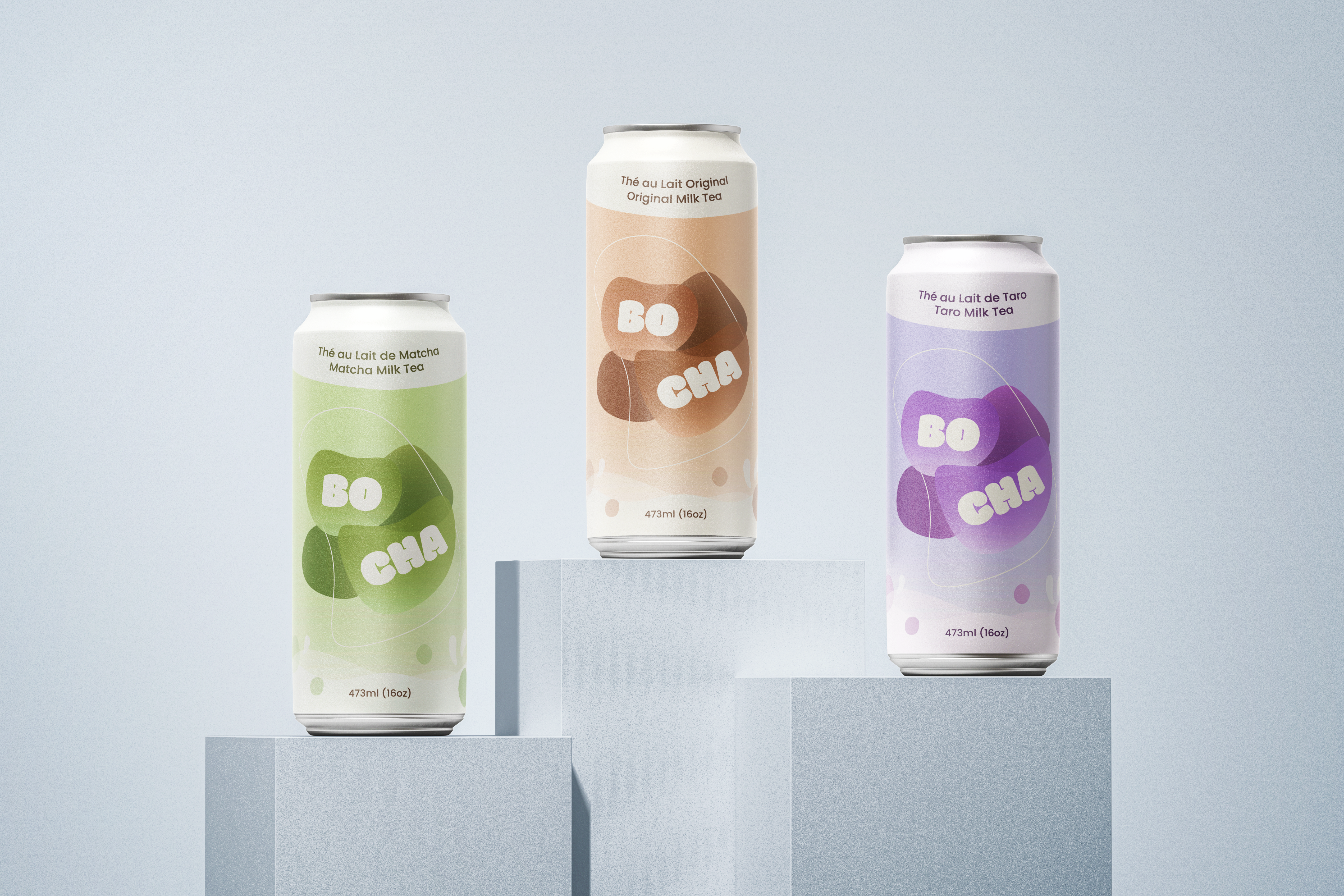
- Color palette:
- Warm and inviting tones designed to capture freshness and playfulness, with each flavour distinguished by its signature hue.
- Milk splash graphic:
- A wave-like splash was placed at the bottom of each can to emphasize the drink’s creamy base.
- Circular motifs:
- Rounded shapes and blobs were used to symbolize tapioca pearls (boba) and enhance the playful aesthetic.
- Bilingual labels:
- Both English and French text were included to reflect Canadian market standards and broaden audience accessibility.
Final Design
The final stage of the project brought the Bocha cans to life through high-fidelity mockups. These designs showcase how the playful brand identity translates from flat dielines into realistic, three-dimensional products.
Reflection and Learnings
- Packaging Systems & Cohesion:
- Learned how to design across multiple SKUs while maintaining consistency and brand recognition.
- Visual Storytelling Through Graphics:
- Discovered how playful motifs like milk splashes and circles can effectively convey the essence of a product without relying on literal imagery.
- Balancing Playfulness & Functionality:
- Explored ways to blend a cute, lively aesthetic with practical requirements such as bilingual text and nutritional labels.
Next Project is...