REPAIR Framework White Paper
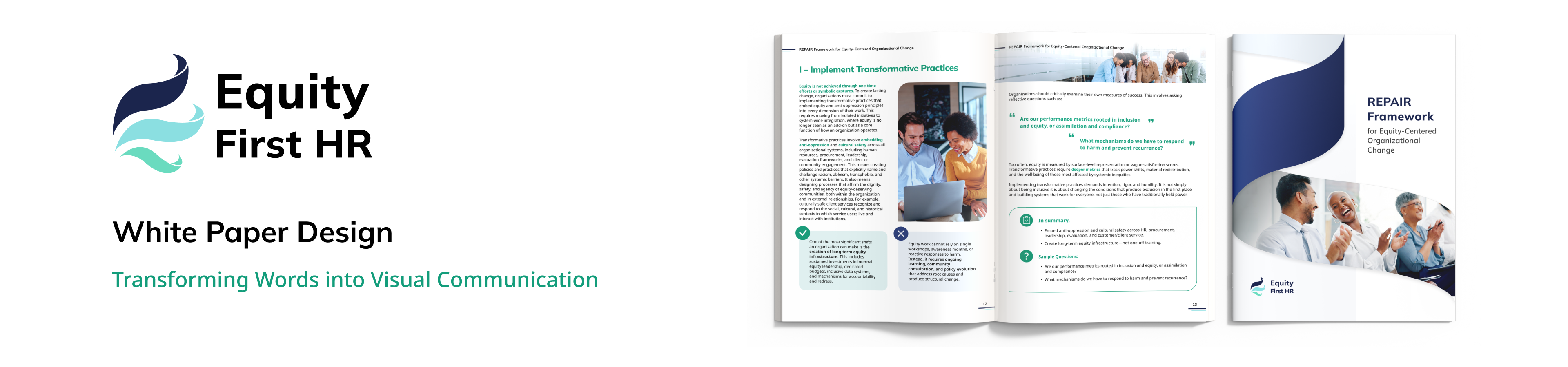
The REPAIR Framework for Equity-Centered Organizational Change is a white paper created for Equity First HR to introduce its proprietary equity-centered change model. Designed to align seamlessly with the company’s existing brand identity, the piece employs the established color palette and typography while transforming a dense Word document into a visually engaging, easy-to-navigate format. The final design features clear sectioning, infographic storytelling, and strong hierarchy to communicate complex ideas effectively.
Role
Graphic Design
Tools
Adobe Illustrator, Adobe Photoshop, Figma
Duration
May 2025 (1 month)
Mock-up
Problem
- Overly dense and text-heavy original content
- Lack of visual hierarchy and user-friendly organization
- Risk of reader disengagement due to overwhelming layout
Solution
- Use strategic sectioning and clear typographic hierarchy to guide readers
- Transform complex concepts into branded infographics for quick understanding
- Design a clean, engaging layout that supports readability and sustained attention
Creative Process
- Research and Inspiration:
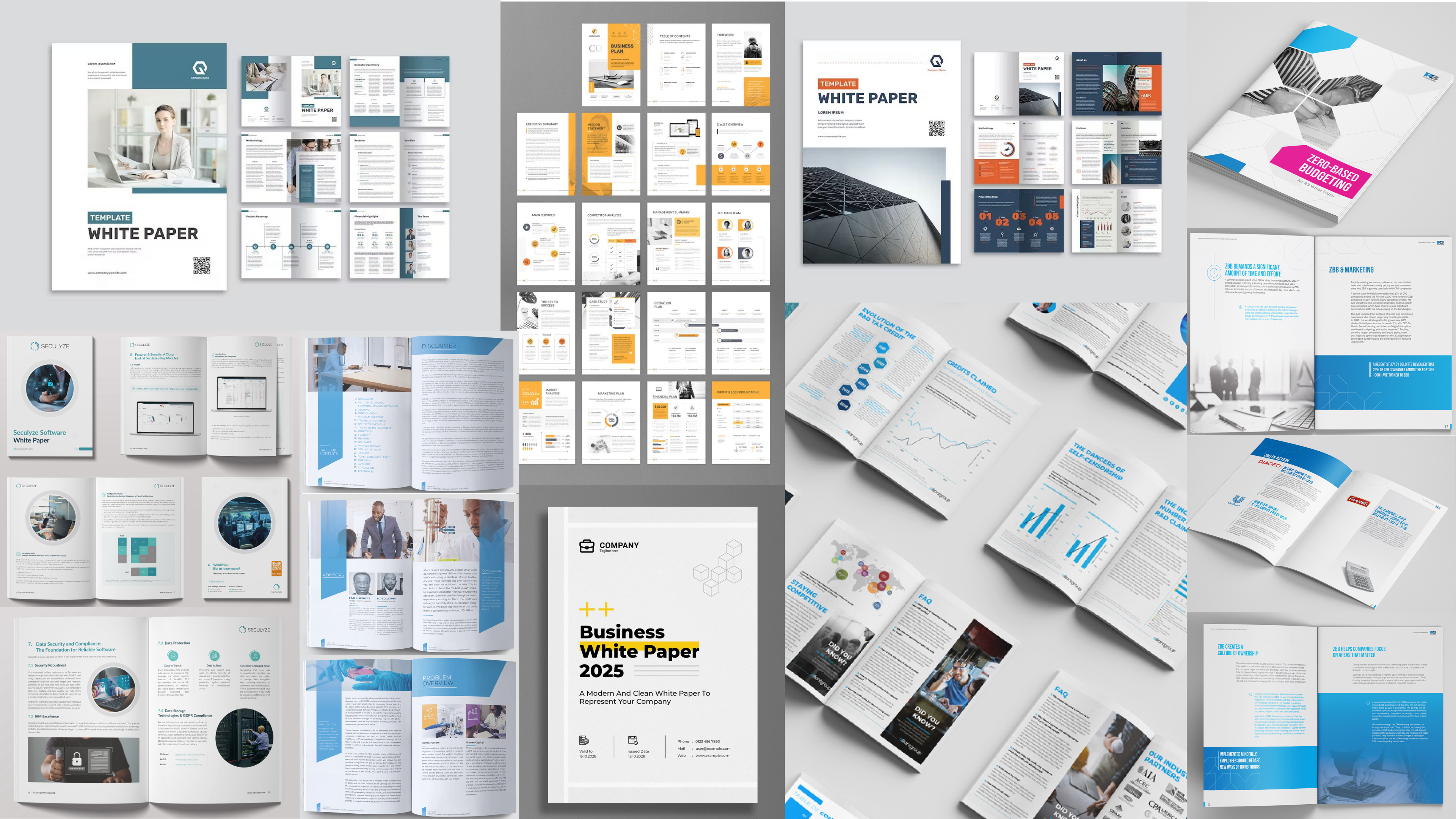
- The design approach was informed by research into contemporary editorial and white paper design trends, with a focus on clarity and professionalism. These examples emphasize clean layouts, structured information flow, and approachable visual language. These references guided the balance between formal presentation and readability, ensuring the white paper resonated with diverse audiences.
Style Guide
The Equity First HR style guide is designed to reflect the company’s professionalism and inclusivity.
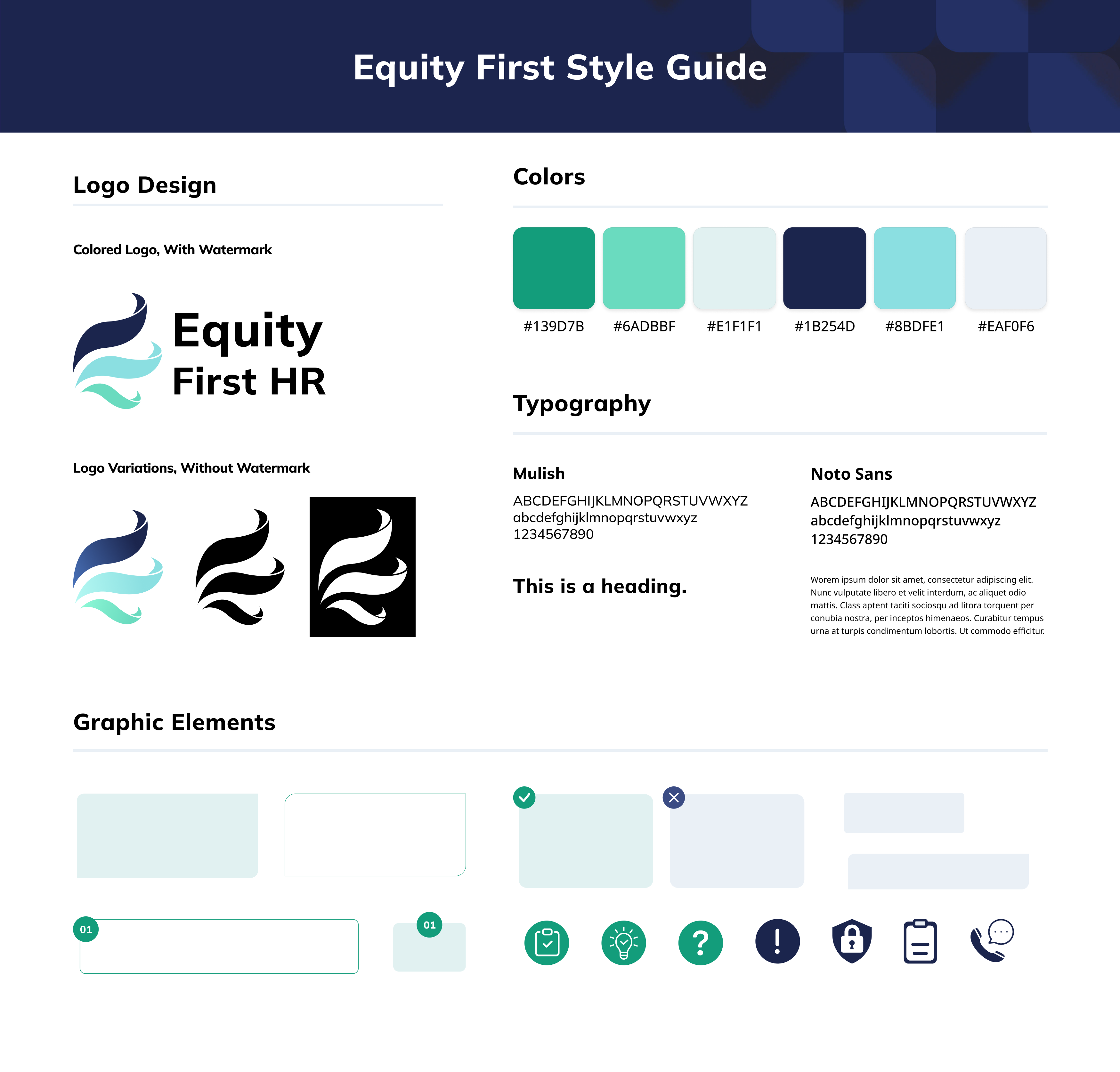
- Colors:
- Green: Represents equity, growth, and forward movement—evoking harmony and clarity.
- Blue: Promotes calm and trust.
- White: Conveys simplicity and accessibility, creating a clean and welcoming space.
- Typography:
- Mulish: A friendly yet professional sans-serif used for headings, enhancing hierarchy and tone.
- Noto Sans: A clean, neutral body font designed for readability across devices, supporting inclusive communication.
- Graphic Elements:
- Rounded icons and graphic accents introduce softness while maintaining structure
Cover Design: Draft Concepts
Several potential cover designs were created to explore different ways of visually introducing the REPAIR framework while maintaining brand consistency.
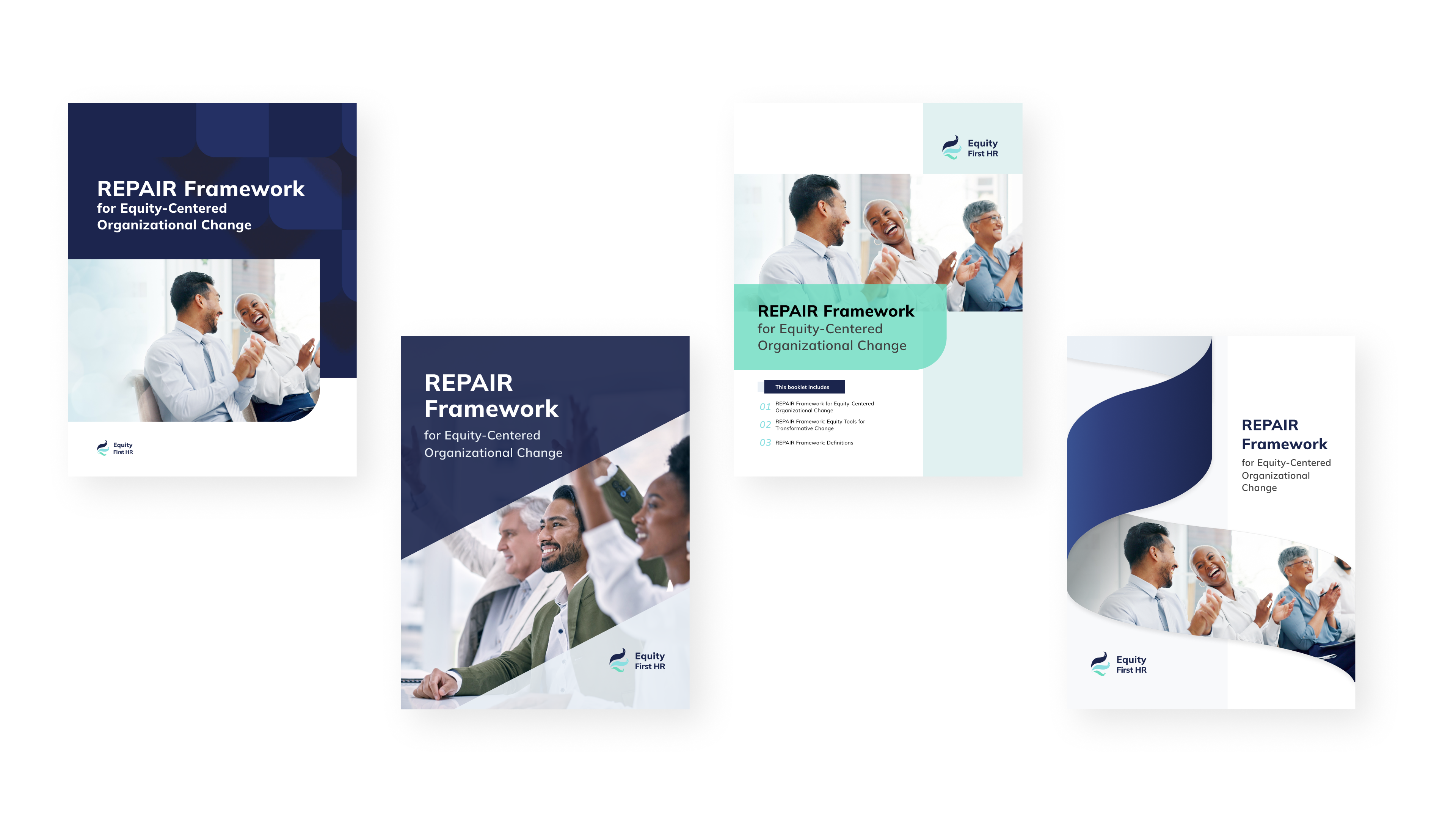
- The proposed designs were presented to the client during review meetings, where feedback was gathered and discussed.
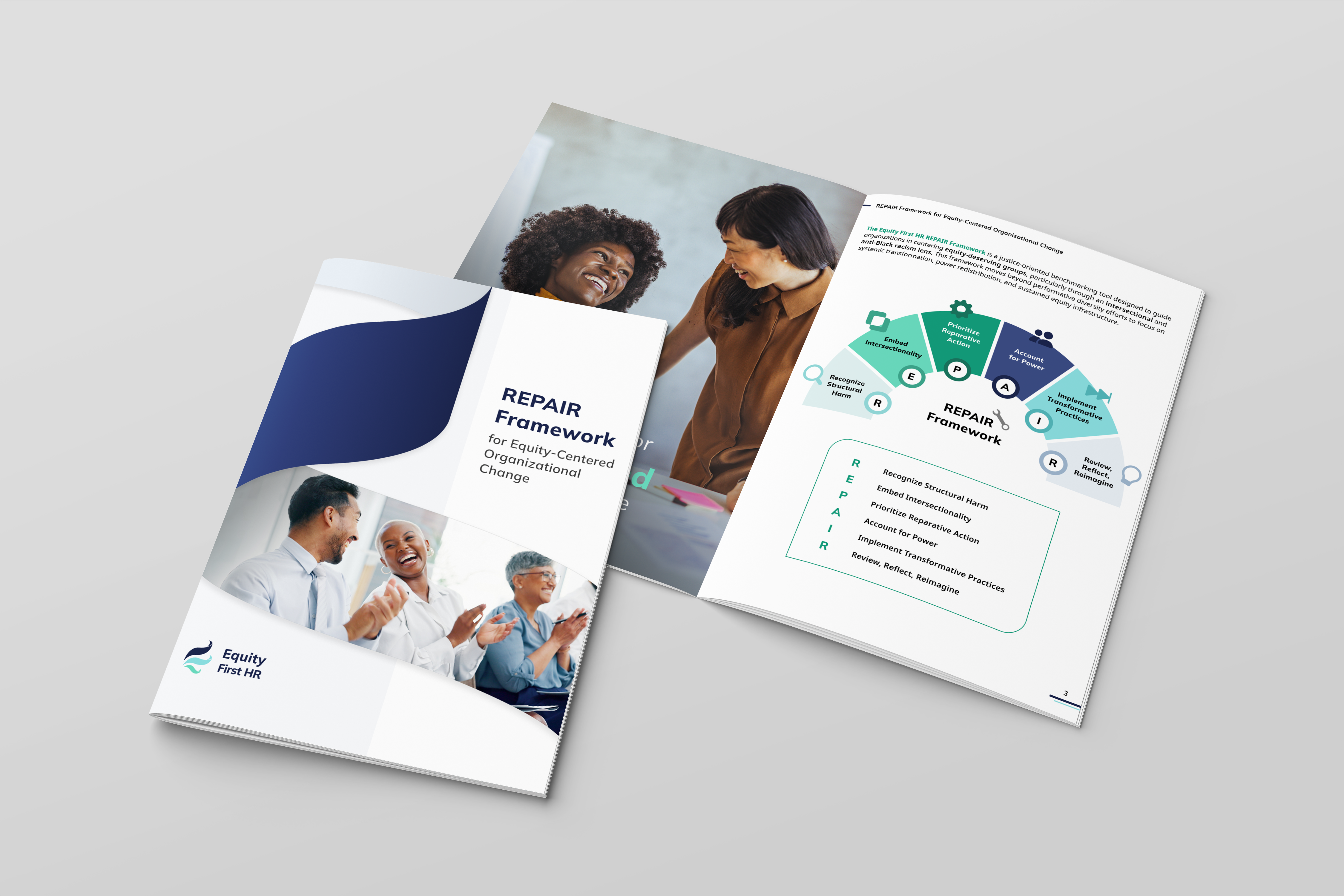
Cover Design: Final Design
After iterative refinement, the final cover was selected for its strong alignment with the company’s visual identity and its clear, professional presentation.
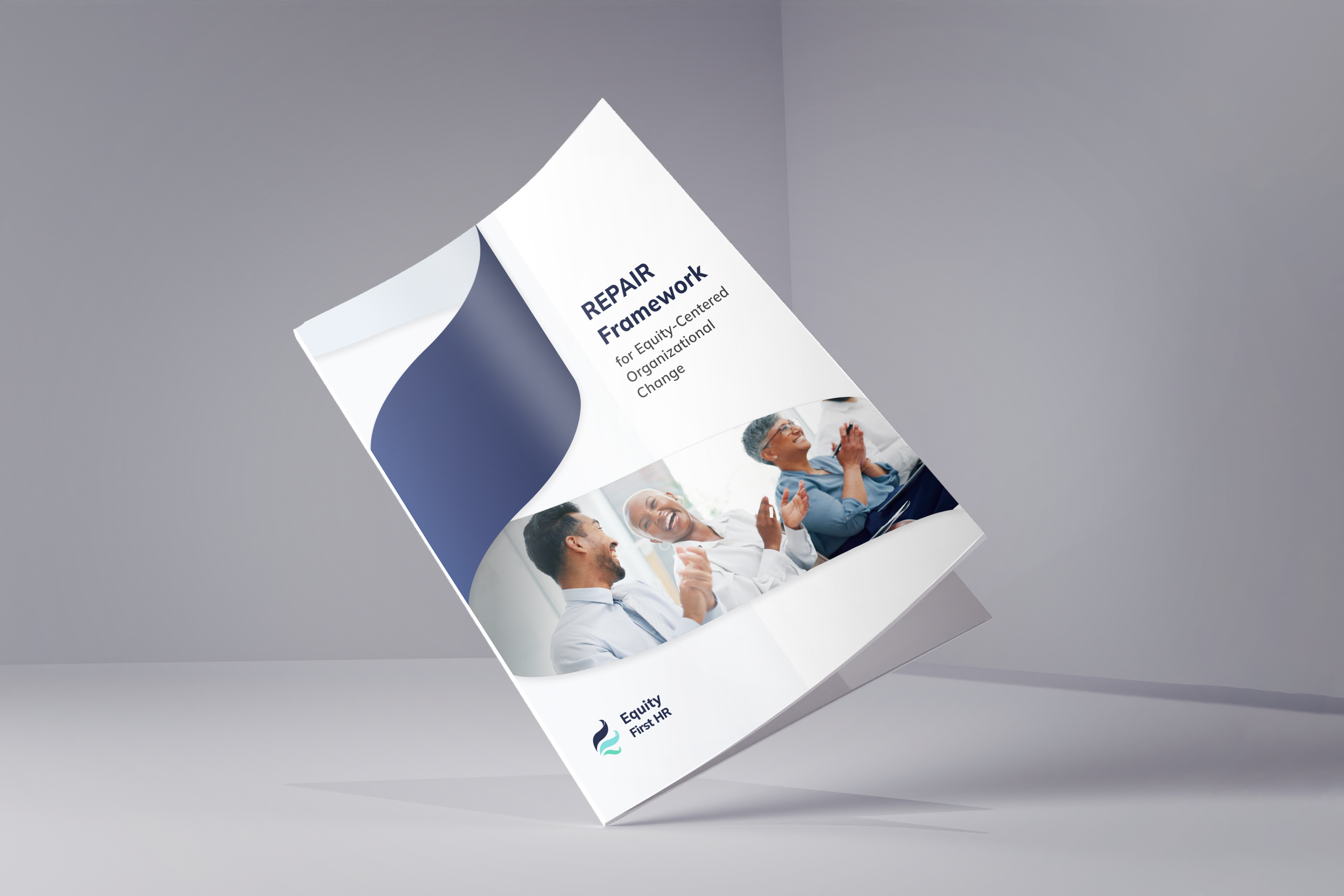
Final cover design:
- The ribbon-like graphic element combined with the cover photo subtly echoes the shape of the company’s logo, reinforcing brand recognition in an abstract yet elegant way
- A deep, dark blue background was chosen to evoke trust, stability, and sophistication, complementing the overall color palette while creating a strong first impression
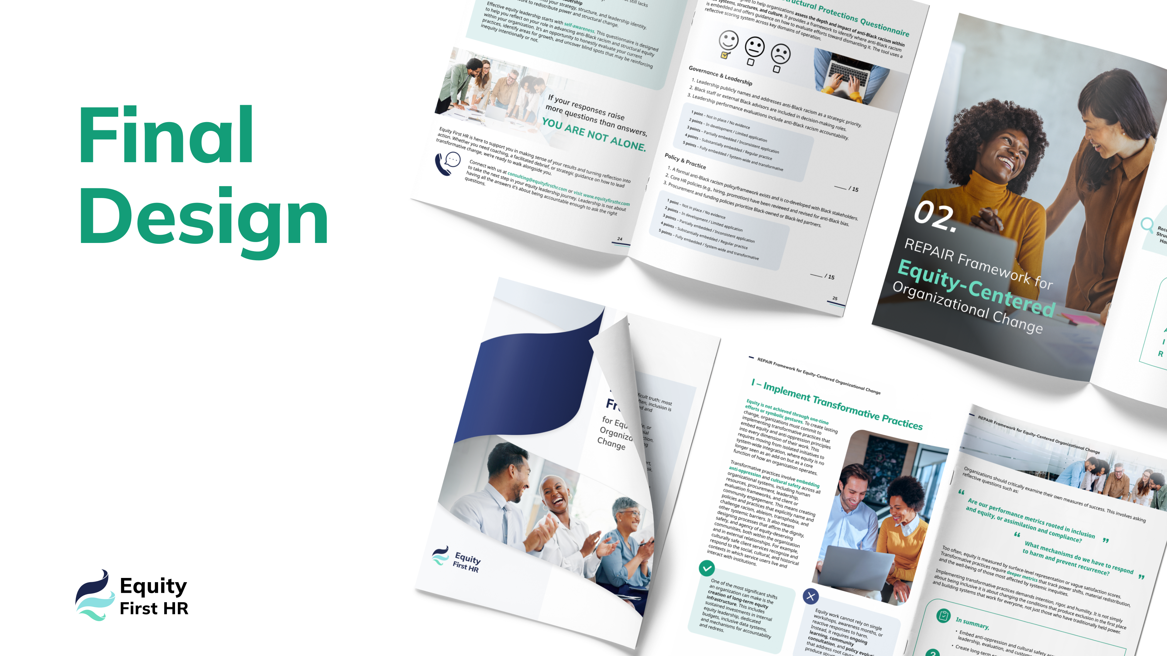
Infographics
The REPAIR framework, a justice-focused tool for centering equity-deserving groups, is transformed into clear, engaging visuals that enhance understanding and retention. By turning complex concepts into accessible graphics, the design helps readers quickly grasp the framework’s key principles while keeping the content visually appealing.

- Focus on Clarity:
- The REPAIR acronym is prominently highlighted to create a strong, memorable impression, with each letter clearly defined and contextualized.
- Visual Aids:
- Custom icons illustrate each stage of the framework, providing intuitive, at-a-glance comprehension and supporting readers with diverse learning preferences.
- Branded Consistency:
- The infographics maintain the organization’s established color palette, typography, and visual style to ensure cohesion and reinforce brand identity.
Poster Design: Final Design
The final design incorporates key elements to ensure brand recognition and audience engagement:
- A clear, intuitive typographic hierarchy
- Well-defined sections for readability
- Branded infographics to enhance understanding
- Alignment with Equity First HR’s visual identity and mission
Reflection and Learnings
- Making Information Inclusive & Accessible
- Learned how to use editorial design, visual hierarchy, and infographics to transform dense, equity-focused information into clear, approachable, and engaging communication.
- Maintaining Brand Alignment
- Understood the importance of reinforcing a consistent brand identity through color, typography, and tone.
Next Project is...