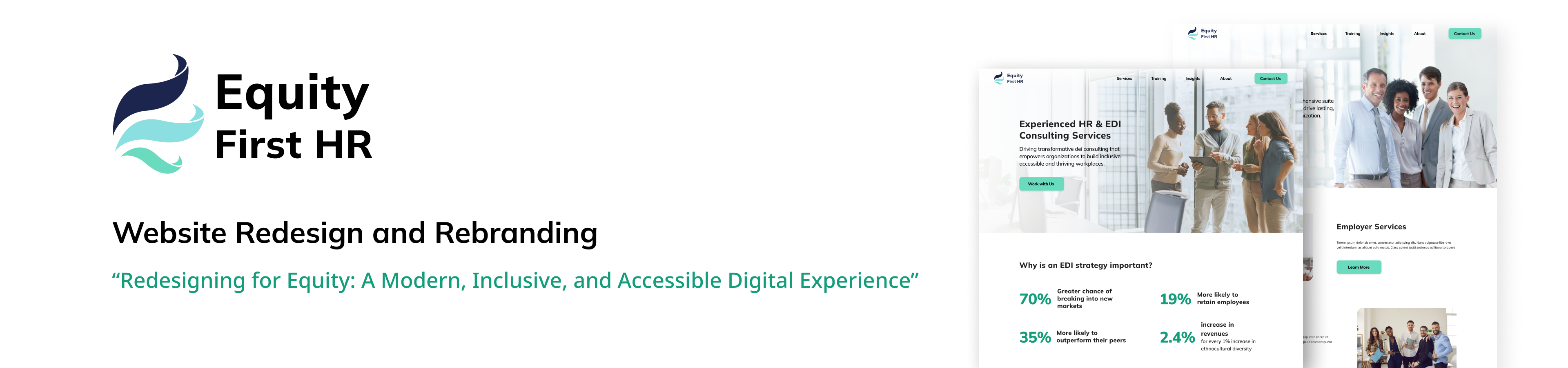
Equity First HR
This project aimed to modernize the digital presence of Equity First HR while reflecting its core values of equity, diversity, and inclusion. The redesign addressed outdated visuals, unclear navigation, and a lack of integration for new services. A refreshed brand identity and accessible website were developed to better serve clients and reflect the organization’s credibility.
Role
UX/UI Re-design, Rebranding, Infographics, UX Research, Graphic Design, Usability Testing, Competitive Analysis
Tools
Figma, Adobe Illustrator
Duration
Apr 2025 – May 2025 (1 month)
Problem
- Outdated and inconsistent visual design
- Navigation issues and accessibility limitations
- Lack of integration of new services like Learning Management System (LMS) and Bias Detection
Solution
- Establish a modern, professional, and inclusive visual identity
- Improve site structure and navigation for all users
- Create clear entry points for new digital services
Rebranding and UX/UI Redesign
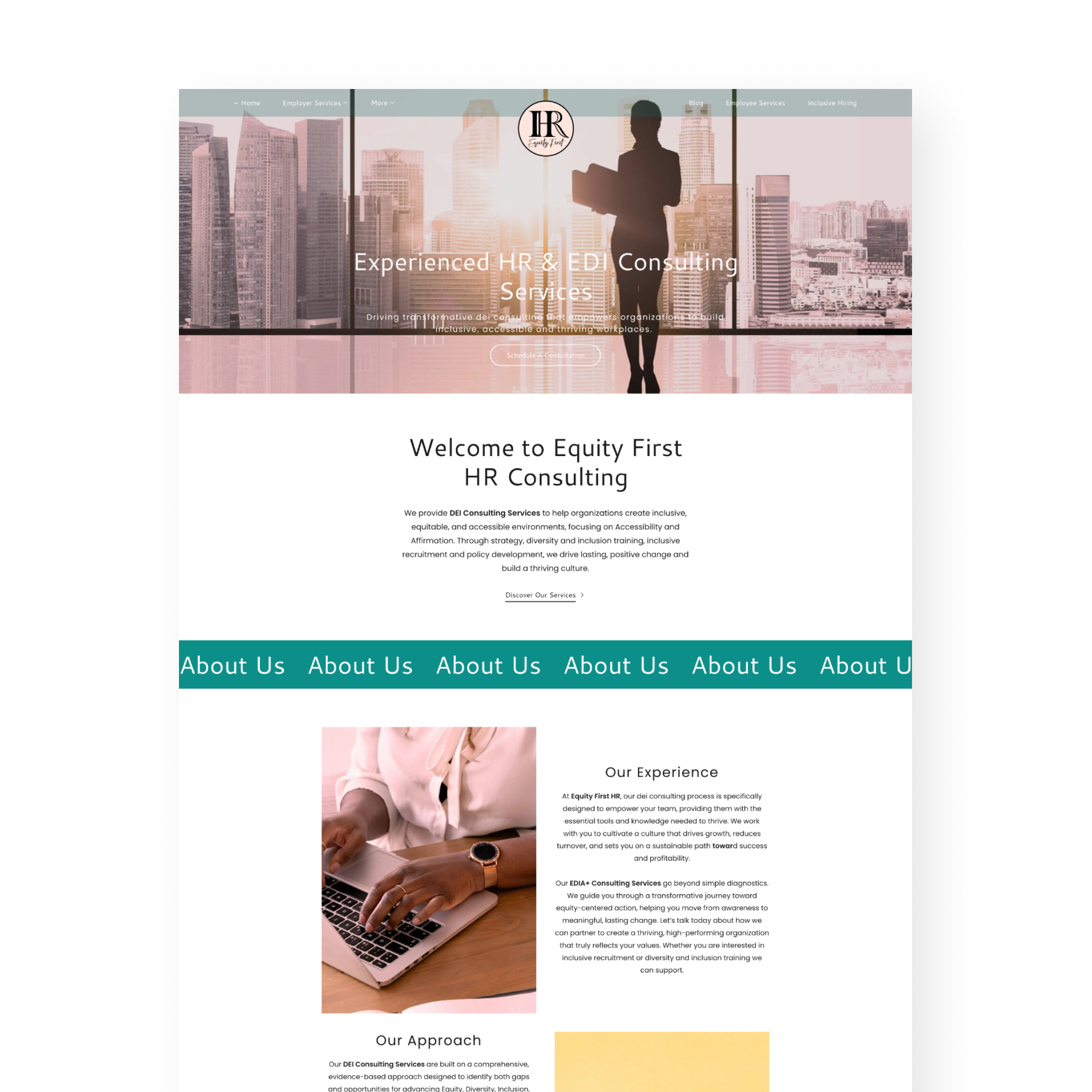
Previous Design
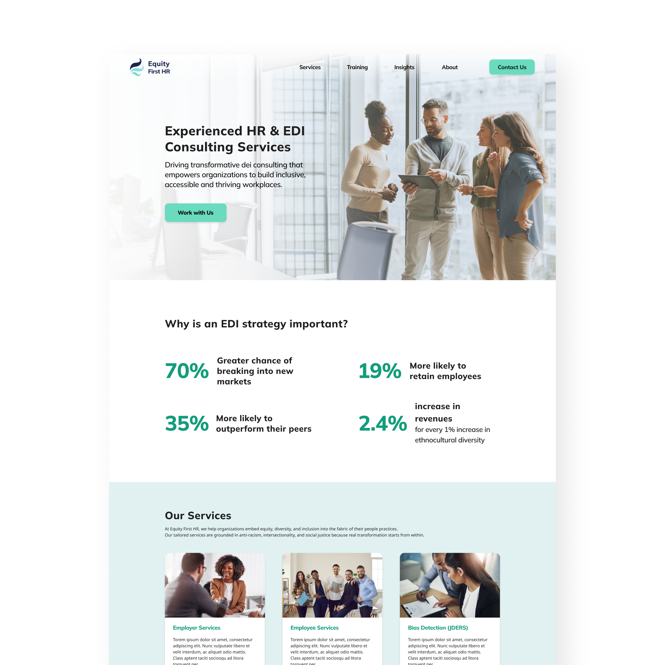
Current Design
Features
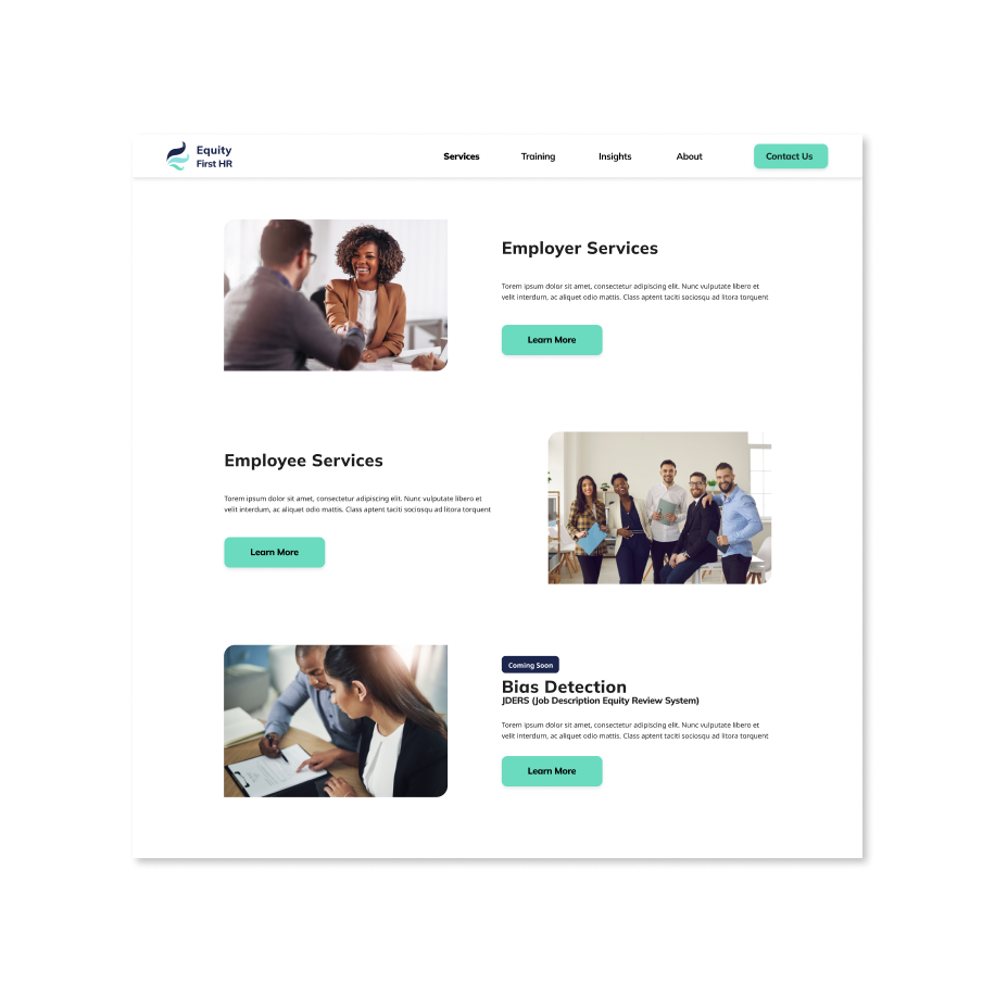
Easy Navigation
- Clear menu hierarchy, intuitive page layout, and visible call-to-actions ensure users can quickly find what they need without confusion
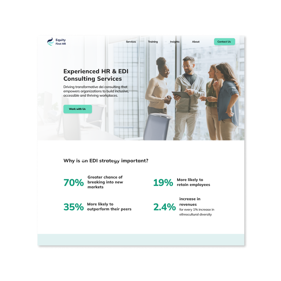
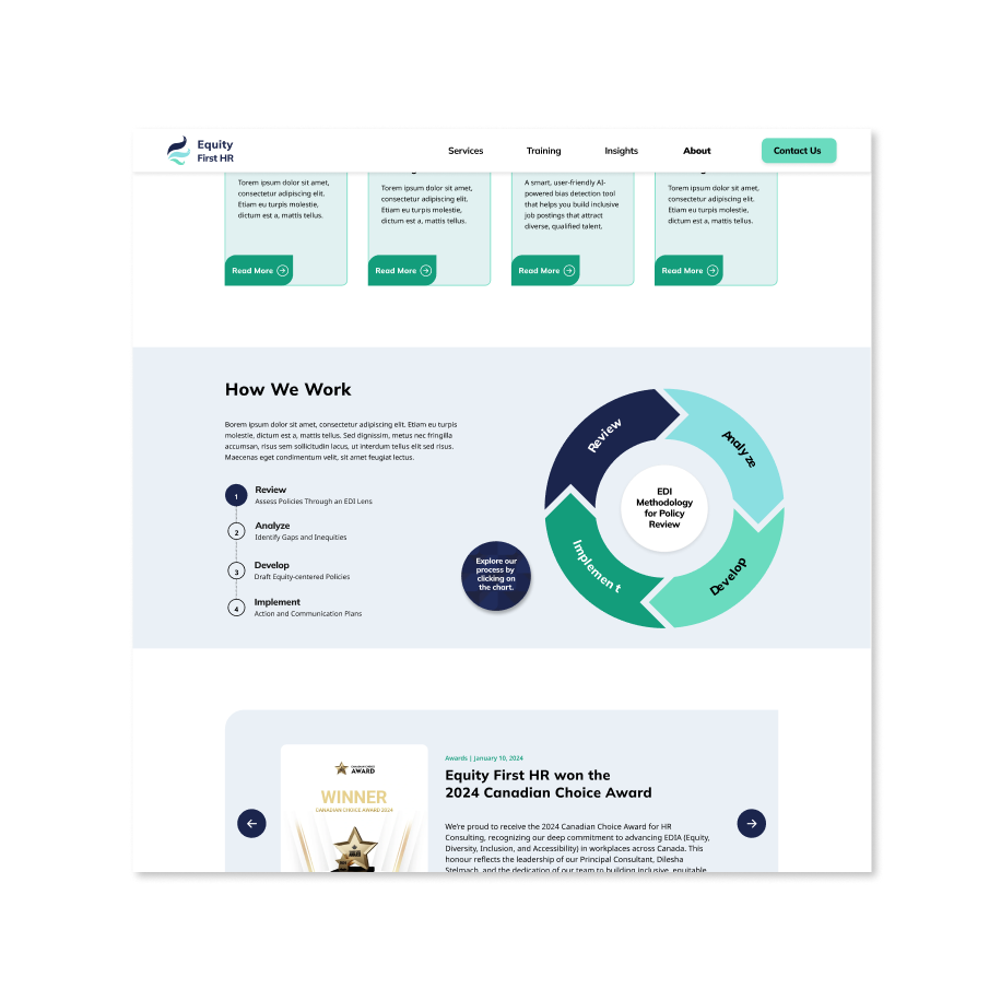
Interactive Infographic
- Engaging visual elements break down complex consulting processes, allowing users to explore information at their own pace and improving content comprehension
Interactive Infographic
- Engaging visual elements break down complex consulting processes, allowing users to explore information at their own pace and improving content comprehension
Great accessibility
- Designed to meet WCAG AA standards with proper color contrast, readable typography, and clear visual hierarchy to support all users
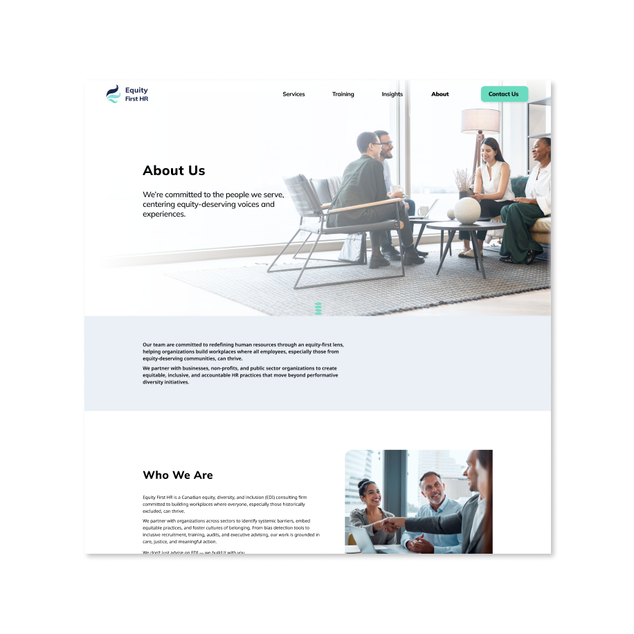
Consistent Branding and Design Style
- Unified use of typography, color palette, iconography, and layout builds trust and reinforces brand identity across every page and interaction
Consistent Branding and Design Style
- Unified use of typography, color palette, iconography, and layout builds trust and reinforces brand identity across every page and interaction
Client Requirements
Following the discussion with the Equity First HR, the following key requirements were gathered:
| Branding |
|
|---|---|
| Goals |
|
| Target Audience |
|
| Requirements content |
|
Competitive Analysis
A review of competing HR and EDI consulting firms revealed common issues such as inconsistent branding, lack of accessible design, and overly complex navigation.
How Equity First HR’s Website Redesign Stands Out:
- Ensure Accessibility:
- Full compliance with WCAG AA standards, including sufficient color contrast and readable font sizes
- Intuitive Navigation:
- Clear hierarchy and consistent menu labels (e.g. “Services” instead of “More”)
- Prevent hidden items on navigation bar
- Consistent Visual Identity:
- Consistent colors, buttons, icons, and page layouts across all sections
- Round diagonal corner rectangles and rounded rectangles for all components and buttons
Style Guide
The Equity First HR style guide is designed to reflect the company’s professionalism and inclusivity.
- Logo:
- Logo features feathers gently wrapping inward, symbolizing freedom, unity, and inclusion.
- Three colors represent equity, diversity, and inclusion.
- Designed for both print and digital use.
- Colors:
- Green: Represents equity, growth, and forward movement—evoking harmony and clarity.
- Blue: Promotes calm and trust.
- White:Conveys simplicity and accessibility, creating a clean and welcoming space.
- Typography:
- Mulish: A friendly yet professional sans-serif used for headings, enhancing hierarchy and tone.
- Noto Sans: A clean, neutral body font designed for readability across devices, supporting inclusive communication.
User Flow Map
The user flow map outlines how users interact with Equity First HR’s website, ensuring a smooth and intuitive experience from start to finish. With accessibility as a main focus, the flow simplifies complex tasks while maintaining clear and user-friendly navigation.
Wireframing
Guided by the site map and user story map, the wireframe was developed to visualize the website's layout and user interactions. Drawing on insights from the competitive analysis, the focus was placed on crafting a user-friendly experience tailored to the needs of the target audience. The wireframe showcases how users will engage with each feature, ensuring intuitive navigation and ease of use.
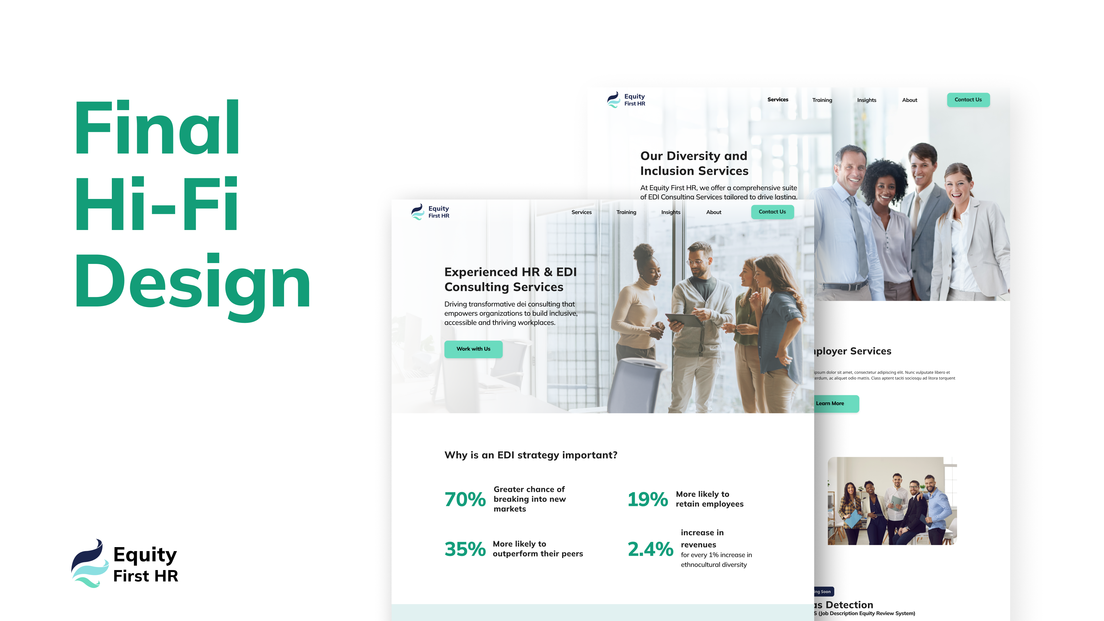
Final Hi-Fi
The final HI-Fi prototype of Equity First HR's redesigned website incorporates client feedback to provide an intuitive, visually appealing, and highly functional website experience.
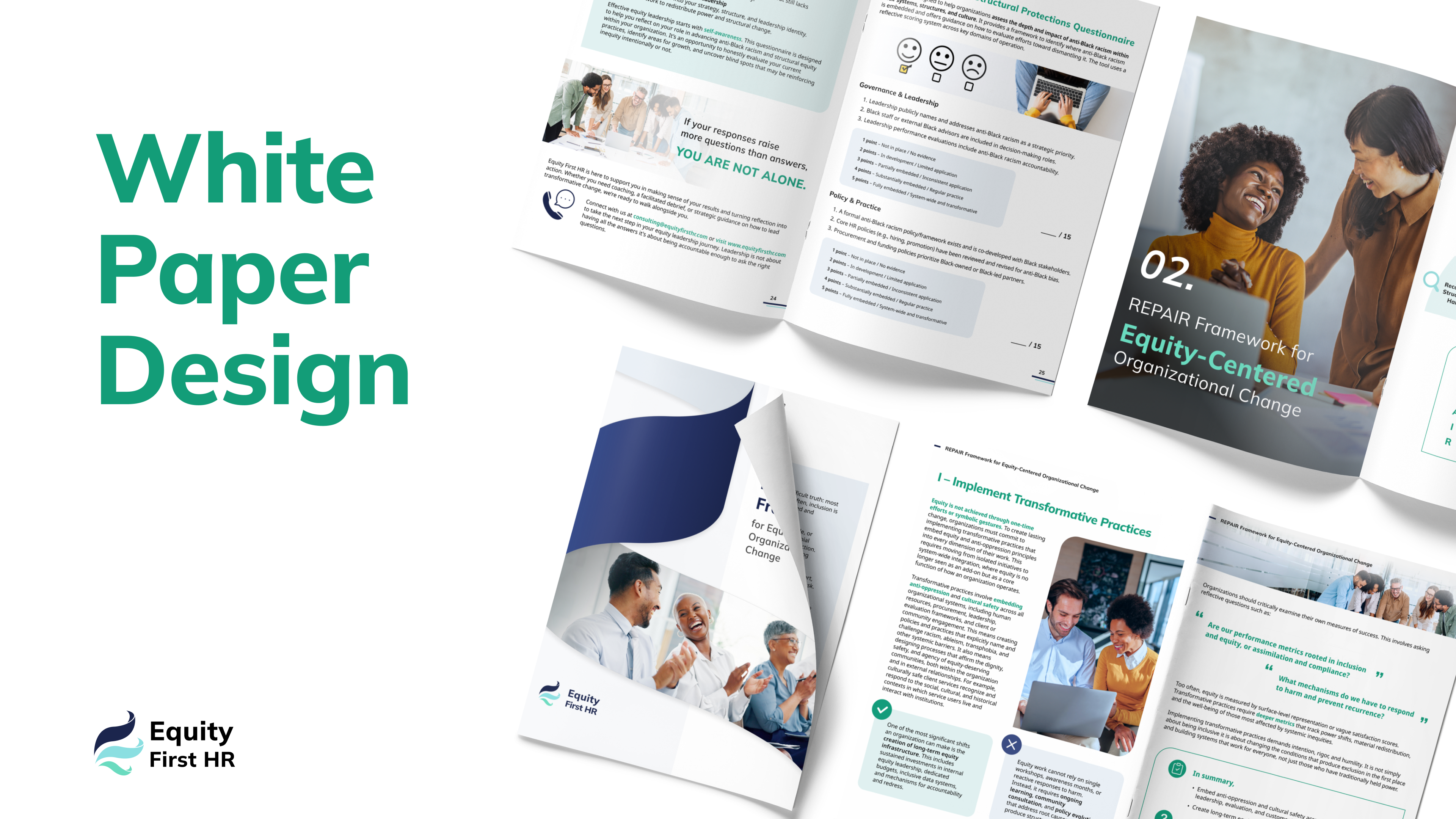
Extending the Brand: REPAIR Framework White Paper
As part of Equity First HR’s broader rebranding initiative, a complementary project involved designing their REPAIR Framework White Paper—a document that translates dense, equity-focused content into a clean, accessible editorial format.
This project showcases how the same visual language—typography, color palette, iconography, and tone—was extended from the digital interface to long-form print collateral, reinforcing brand consistency across platforms.
Reflection and Learnings
- Rebranding:
- Aligning brand identity with organizational values by developing a cohesive visual system that communicates professionalism, inclusivity, and trust.
- UX/UI Redesign:
- Evaluate and improve existing websites by identifying usability issues, restructuring content, and implementing modern, accessible design patterns.
- Data Visualization:
- Developing interactive infographics that translate complex consulting processes into digestible, engaging visuals—enhancing clarity and user engagement.
- Remote Collaboration:
- Close coordination with clients (via Zoom, Figma, Discord and email) ensures designs evolve to meet real business needs.
Next Project is...